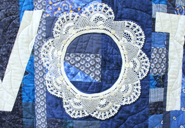
Election Day

The wild success of a crocheted doily trim as the letter “O” in What to Do in a Democracy, got me thinking about other literary possibilities for the doilies in my collection.
Let’s see. Through the summer and fall of 2020 I worked to make sure people were registered to vote and encouraging them to actually do it. So what other word besides VOTE had an “O” to fit the theme?
The word “election” has an “O!” Yay! But my collection of vintage crochet didn’t include a round doily trim of a reasonable size.
I would have to crochet the “O” myself. Saying “I’ll do it myself,” makes me feel like the Little Red Hen, who had to plant, harvest, and grind wheat in order to make bread. “I’ll do it myself,” sounds really sassy in a broad Texas accent, which I, a Texan, can do.
Unlike the Little Red Hen, I was happy about crocheting the doily “O” myself. I took advantage of it being custom crocheted, by using red thread for the center, so it would fade into the red patchwork background. The last few rounds were in white to create the letter. I had to alter the pattern to make the doily small enough, because the bigger the doily, the bigger the finished quilt.

You can find the original doily on Ravelry, where the notes say it was “published as ‘The Very Best Circles’ in Home Favorites in Crochet, Book No. 214, in 1944; as ‘Three Piece Doily Set No. 7699’ in The Complete Book of Crochet in 1946.” Download the free pattern here.
Election Day was finished in 2020. See if you can find the not-so subliminal message in the quilt’s patchwork.
If you’re interested in how to create and applique the white lettering, read the post about What to Do in a Democracy. Link above.

What to Do in a Democracy

I was a new Volunteer Deputy Registrar in 2018. My job was to give people voter registration cards, help them understand the forms, and return the completed forms to the proper county office. It can be fun, or deadly dull, depending on how many people want to register.
How could I attract more people to the voter registration table?
Display a quilt, of course!
People would come by to check out a happy red, white, and blue quilt that reminded them to register to vote. They would surely ask me about it, especially if they or one of their relatives was a quilter. We would discuss the quilt, and I would ask casually, “By the way, are you registered to vote?”
Making a quilt seemed like a good plan.
Luckily, I had plenty of red, white, and blue fabric scraps. A doily in my collection had a fabric center and pretty crocheted trim. Hmmm. If I removed the fabric (it was damaged), the crocheted trim could be the letter “O” in VOTE. Perfect!

The quilt’s title is What to Do in a Democracy, and it was finished in 2019. I couldn’t resist a little subliminal messaging. Can you find it? Examine the patchwork and the buttons.
Someone asked, “Is the crocheted ‘O’ meant to be a tribute to Ruth Bader Ginsburg?” Well, I hadn’t considered that, but it sounded good to me, so…yes!
Displaying What to Do in a Democracy. has been fun, and it has led to pleasant conversation. However, my wish is that this quilt soon will be a quaint, out-dated relic. My wish is that every U. S. citizen is automatically registered to vote when they turn 18 years old.* I will happily hang up my Volunteer Deputy Registrar hat when that day arrives.
If You’re Interested in Process
The quilt had to be designed around the doily trim, because I couldn’t easily alter its size.
My favorite tool for rough-drafting wall hanging designs is Adobe Premier Elements.
I opened a new image and added a circle the size of the doily trim. That was the “O” in VOTE. From there, I tried different font sizes, until the rest of the text was the correct size.
Once the text was designed, I figured out how big the quilt background needed to be, designed stars, and placed them within the design.
I printed the design, full size, in a very pale grayscale to preserve toner. I trimmed and taped together the pages. Here’s how I created the letters and stars in fabric:
- Roughly cut letters out from the paper.
- Cover the backside of each letter with basting spray.
- Arrange sprayed letter on white fabric.
- Cut out the letter carefully, using paper as the pattern.
- Turn paper/fabric letter to fabric side and spray again with basting spray.
- Arrange letter in its place on the finished quilt top.
- Carefully remove paper.
- Zigzag stitch all around the cut edges of the fabric letter. This is one method of raw-edge applique.
- Repeat steps for each letter.
* Undoubtedly, some will un-earn the privilege later on, but until that happens, let’s give everyone the benefit of the doubt.
Constant Comets

I have a dream, where stars are frolicking in the night sky.
It’s a recurring dream. I’m outside at night. I look up, and stars are chasing each other across the sky, turning somersaults, and tumbling around in crazy spirals. They’re playing. Like I said before, they’re frolicking.
The dream makes me happy, and I’m glad it comes back from time to time.
Dreams give us a glimpse into our unconscious. Since humans seem to share a collective unconscious, I think—I hope—that art inspired by good dreams resonates with people on an unconscious level and affects their waking lives.
I’m pretty sure that Constant Comets was influenced by my dream. Other things added to the inspiration. Doilies with star or star-like motifs play into my vision of a night sky. I don’t know what it is about doilies crocheted with white and golden-yellow, but they look to me like blazing celestial bodies.
Then there’s the combination of royal blue and golden yellow and white. It’s a delicious combination—one of my favorites. Luckily, my stash had a lot of royal blue bits of fabric at the time when Constant Comets got underway.

To get a feel for how my doily comets would move across the sky, I made a digital sketch, starting with photos of the doilies I was going to use. I measured each doily and made sure the digital measurements matched the real ones. That way the proportions in the sketch were more-or-less accurate. (I use Adobe Photoshop Elements. It has all the features I need, but is much more affordable than the full Adobe Creative Suite.)
After arranging the doily pictures, I roughly sketched in the comet tails. When you’re working on something up close, it can be difficult to see the bigger picture. The sketch gave me an idea of the bigger picture, but I wasn’t obligated to copy it exactly.

It was time to make the quilt top. When I’m trying to use up fabric scraps, I first patch together some medium-sized blocks. I lay them out on the floor, within the desired measurements of the quilt top. Then I fill in the empty spaces with more patches.

When the top was done, I started sewing on doily comets, and I couldn’t wait to start giving them tails!

Constant Comets has been exhibited as part of the Celebrate Doilies art quilt show since the summer of 2017. It will be in the show “Pieces of Us,” through June 25, 2021, in Stephenville, Texas. Details here.
My favorite memory about Constant Comets was when Celebrate Doilies was in Comanche, Texas, at the 4 North Event Center on the town square. That was when I first met Pat Reese, a fellow textile artist. We became friends immediately. Pat gave me a wonderful compliment about Constant Comets. “It makes me want to sing,” she said.

***
Find Constant Comets in TextileFusion’s Market. The wall hanging measures 39 x 46 inches.
Studying Yellow, Part One
Once there was a wonderful magazine called INKnitters, published by Diane Piwko. I contributed long, in-depth articles about all kinds of things related to knitting. Color was a focus. I was particularly interested in yellow, as you’ll read below. The article was finished and photos taken, when Diane decided to discontinue publishing INKnitters in 2006. It was the end of an era.

Sunshine, cowardly, lemon, journalism: yellow is many things. I was surprised learn that yellow is also “difficult.”
A friend took a creative color workshop with a well-known knitting instructor. Each student chose one color to study for the day. “But don’t pick yellow,” said the instructor. “It’s difficult.”
I scoffed at this, but to my amazement, someone made the same pronouncement at an international quilt show.
Well, I say if a color is allegedly difficult, working with it is the only way to learn to use it well.
So let’s take a look at yellow together, then you can use these methods to study any color you may find difficult. The best part is, no color wheel is necessary.
Basic Steps
Decide which specific variety of your chosen color you want to study.
Yellow ranges from pale creams (yellow + white) to rich olive shades (yellow + black). Yellow school-buses are really orange-yellow, while fluorescent yellows have greenish overtones. Given the large variety of yellow, I concentrated specifically on brilliant yellows.

Step 1: Observe Your Color in Different Surroundings
Look for your color in nature, in human environments, in magazines, quilts, your own home, photos, museums, and books. At this stage, the goal is to gather lots of information about the color, and avoid judging the color combinations you see.
Step 2: Answer these questions about the color and its surroundings.
- What other colors are near the study color?
- Are the nearby colors lighter, darker, or similar in tone to your color?
- Do you see shadows or highlights that enhance the study color?
- What are the proportions of the various colors?
Tip: Answer the questions in words, spoken or written, rather than just taking a visual impression in your brain. Writing answers on paper may help you focus on what you actually see, rather than what you remember from a mental snapshot. I’m always forgetting details about my mental snapshots.
Step 3: Make Sample Swatches
Knit or crochet samples with the color combinations you observed. This is your chance to try out some interesting stitch patterns. I still use Barbara G. Walker’s treasuries of knitting patterns. For crochet, my favorite is Harmony Guide to Crocheting Techniques and Stitches, by Debra Mountford, editor (1992).
Yellow in Nature

We have lots of yellow out here in rural Texas, so I took some photos for this study. Here’s a picture of a county roadside near our house.
I wrote answers to the questions listed above:
The lemon and orange-yellow flowers are surrounded by deep yellow-green and paler dusty-green leaves; also light brownish-gray dried leaves. The caliche road and the earth are light beige with pink undertones, but very bright. Flower centers and shadows are dark. Shadows aren’t exactly black. The amount of yellow is small in comparison to the greens and browns.
Just so you know, you may not like how your samples turn out. I didn’t like this one.

Going back to the original photo and my own words, I realized the deep shadows that added contrast to the scene were missing. Here’s the next sample with the deep shadow color added.

I wasn’t overly fond of this one either, but I have learned not to let this put me off. Making these samples time well spent. I learned something about these colors together. They may be perfect for a wall hanging someday. They may look better in different proportions. They may look a lot better to me in a few years.
It was time to move on.

Like this picture of nightshade berries and a grasshopper, yellow in nature is often seen with black, gray, and various shades of brown. Some tan or grayish birds have a patch of yellow feathers.
Here are knitted samples of yellow with grays and tan.

They’re alright. Interesting.
Next time: Yellow Around the House.
Studying Yellow, Part 2
Yellow Around the House

Awww, Izzy. She was a pretty and sweet cat!
Like many animals we’ve known, she knew how to present herself to her best advantage. The Holstein-patterned fuzzy fabric matched her perfectly and made us wonder “Is it a cat? Is it a cow?” Meow!
The yellow margarine tub happened to be nearby, adding a pop of color to the mysterious scene.
Yellow with black traditionally means danger or caution, in natural and human environments. Think of bees and some wasps, with their yellow and black abdomen–Beware of the stinger! Think of yellow and black striped road signs that alert drivers to bridges or odd intersections–Watch out!

I think that tiny bit of white lifts the yellow-black combination from the caution zone into a happy place.
When I saw Lion Brand’s black and white FunFetti (now discontinued), I didn’t even make a study swatch. I combined it with yellow Wool-Ease to make this scarf. It was my first yellow triumph, thanks to Izzy the cat.

We had wildflowers around the house: Texas Bluebonnets, which you probably recognize as lupines; Winecups, which look like brilliant Easter eggs hiding in the grass; and profusely yellow Engleman’s Daisies. They form one of our spring’s most delicious color combinations.
The bouquet inspired me. I wanted to knit the blue, magenta, and yellow.
But wait! Let’s go back to the basic steps in Studying Yellow, Part 1, and answer the questions:
What other colors are near the study color (yellow)?
In the garden, I saw blue and magenta near the yellows, but also green.
Are the nearby colors lighter, darker, or similar in tone to your color?
The magenta is darker than the yellow, but they seem to have the same saturation. They’re brilliant. The blue and greens seem paler and recede from the brilliance of the yellow.
Do you see shadows or highlights that enhance the study color?
There are some shadows in the greenery, but to me they don’t enhance the yellow.
What are the proportions of the various colors?
In the bouquet, the proportions of yellow, magenta, blue, and green are roughly the same.

For my swatch, I went for randomly colored intarsia squares. I love this sample!
Really, it’s one of my favorite samples and I have wanted to expand this idea into a project for a while—like over a decade. But what would I make?
Within the past year, I think I have settled on a project.
Poet Sandi Horton has written several pieces for my Celebrate Doilies exhibit. She sent me a few as inspiration for a wall hanging. Her poem “Texas Hillside” describes these flowers almost exactly, and someday I’ll make a randomly-colored intarsia check wall hanging about it.

Studying Yellow, Part 3
Consulting the Experts
Maybe we don’t think about it every day, but we are surrounded by the work of color experts. Fashion, food, craft magazines, advertisements, variegated yarns, and print fabrics are created for maximum appeal. Creators want you to buy them, so they make them beautiful.
We can borrow their color expertise!
For my study of yellow, I gathered magazines that were destined for the recycling bin. When I saw attractive photos and ads with yellow in them, I tore them out.

I ended up with a lot of pages that featured yellow, turquoise, and blue. That summery combination reminds me of swimming pools and sunny beaches with turquoise waters.
Maybe it wasn’t strictly necessary, but it was fun to make this collage…
…and these swatches.

Intarsia cables are kind of a pain, but they look so nice…
As yarn lovers, we’re very familiar with variegated or multicolor yarns. Yarn manufacturers consult experts, predict fashions, and they pick the colors they think will appeal to the most consumers. The same goes for fabric manufacturers.
Go ahead—borrow their expertise!

Lion Brand’s Lion Ribbon (probably discontinued now) combines yellow with vibrant pink and blue. Small amounts of green, orange, and violet appear between the major colors. I tried to use similar proportions of solid colors in my knitted sample.
The pattern is Barbara Walker’s “String of Pearls,” most likely from her Second Treasury of Knitting Patterns.
Next time: “A Suffusion of Yellow” (Thank you, Douglas Adams.)

Studying Yellow, Part 4
A Suffusion of Yellow
This is the last of four installments of my article about how to study a color with the goal of using it in your craft. I’m using the color yellow as an example for following the method. You can use the same method with any color.
Do you remember when lateral thinking was a new concept? Was it in the 1980s? Okay, well, you may not remember, so please take my word for it that self-help and business success writers wanted us to break away from linear or logical thinking, which sometimes involves being in a rut. Instead of tackling a problem or project in a linear way, they wanted us to take unorthodox approaches to problem-solving.
“Lateral” means moving to the side, or being on a side, or going from side to side. That makes sense in terms of lateral thinking, because you’re seeking solutions off the beaten path.

But the “lateral” part of lateral thinking bothers me, because it implies that your thinking is constrained to one plane. Think of high school geometry. That’s the kind of plane I’m talking about.
For the 21st century, I propose a new dimension in problem-solving. Maybe we’ll call it starburst thinking. You begin with a project or problem at the center, and you reach out for ideas in all directions: side to side, up, down, all around, into the past, into the future.
Or maybe global thinking? Nope, too small. Universal thinking?
It’s not just thinking outside the box, but thinking and researching and paying attention all around the box, inside and out, for a long, long way. Granted, a lot of the time, you won’t find anything in the vast territories you cover. However, eventually you’ll run across a clue, an inspiration, a signpost that will lead you to the idea or solution you need. It may take you a while.

Here are some of the things I did when indulging in starburst thinking about the color yellow:
- Made a list of words associated with “yellow.” Roget’s Thesaurus was the best reference book for this.
- Looked up “yellow’ in the dictionary to find alternate meanings and interesting nuances, like how yellow is associated with cowardice.
- Found other ways “yellow” used, that actually had nothing to do with yellow, like “yellow journalism.”
- Found examples of yellow in nature and decorative art.
- Collected relevant quotes from whatever I was reading or hearing, that pertained to yellow.

Let’s start with the thesaurus, which had a long list of yellow colors and pigments:
Dutch pink
English pink
Italian pink
Acid yellow
Amber
Apricot
Barium yellow
Brilliant sulpho
Butter
Cadmium yellow
California green
Flax
Mikado yellow
Milling yellow
Olivesheen
Orpiment
Yellowness:
Flaxen
Ocherous
Ochery
Gild
Aurify
Aureateness
Lutescent
That brings us to “a suffusion of yellow.”
Douglas Adams wrote The Long Dark Tea-Time of the Soul. Dirk Gently, the main character and a self-proclaimed holistic detective, buys an I-Ching calculator. When he calculates anything where the answer is greater than 4, the calculator displays the phrase: “a suffusion of yellow.”
What an interesting idea. A saturation of yellow. A pouring over of yellow. I saturated my mind with words and images that had to do with yellow, and went from there.
Now it’s your turn.

Gaudí Gaillardia

Gaudí Gaillardia (2015) is my Texas-style interpretation of a stained glass window in Parc Güell, by Barcelona’s famous architect, Antoni Gaudí. A common and lovely wildflower of Texas, the Firewheel, aka Gaillardia, replaced Gaudí’s original stained glass design. A grill of weaver’s needles, joined in a pattern of triangles, protected Gaudí’s window. I crocheted the grill for the wall hanging, and added buttons and a knitted triangle pattern to invoke the fabulous mosaics that Gaudí is so well-known for.
Making Gaudí Gaillardia

The color scheme for Gaudí Gaillardia was fairly straightforward, so I marked the color areas on a full-sized sketch, and labeled each piece. For instance, the yellow parts of the flower petals were labeled “Y1,” Y2,” and so on. Similar for the other colors. Before cutting the sketch apart, I made sure to take a photo of it, to help me put the pieces back together.

The next step can be stressfully interesting, because I roughly guess-timate how much of each color to knit, and sometimes my guess can be too close for comfort. This time everything went well. I arranged and pinned the cut-out, numbered pieces on the proper color of knitted fabric, with room to spare.

Once they were cut out, I put the pieces back together like a jigsaw puzzle, using the photo for a guide. I removed the paper, little by little, and pinned the knitted pieces to a foundation fabric.

When you look at a Firewheels along a roadside, quite a few of the flowers seem to be missing a petal. That’s just how they grow. I think of them as snaggle-toothed flowers, and I’m telling you this in case you were thinking, “Why is there a big wedge of purple, where the petal should be?”
After sewing pieces to the foundation fabric, embellishing to make the flower look more like stained glass, stitching layers together, and binding, I had this bright, beautiful flower.
Sometimes you get to a point in a project, where it looks really good, and you think if you keep going, you might mess it up. That’s how I felt about adding the gray crocheted grill, which was meant to look like Gaudí’s weaver’s needles.

More reasonable thoughts took over. If I didn’t like the crocheted grill, I could always pick out the stitches and take it off. Hand-sewing the grill onto the surface of the wall hanging took a while, and when it was done, I was pleased with the effect.
Gaudí Gaillardia will soon be available for sale under the TextileFusion Market tab (see menu above).
The Fateful Hat

My mom taught me to knit when I was seven years old. I loved it immediately.
Sometime later, she got out a crochet hook and some yarn, to teach me how to crochet. I was not interested.
The early 1970s rolled around, and Mom picked up a Woman’s Day magazine at the grocery store, as she often did. And there was this hat. This yellow and orange, floppy brimmed, granny square hat.
“Mom, I want to make this,” I said.
You wouldn’t believe it now, but in the early ’70s, Austin, Texas, had a limited selection of yarns. You could find worsted weight Sayelle at the supermarket and K-Mart. By some miracle, we found the yarn the pattern called for, Aunt Lydia’s Rug Yarn, in orange and yellow. Maybe it was at K-Mart or TG&Y. I don’t remember.
Mom showed me how to crochet, and I made the hat.
So why does this come up now?
The Center for Knit and Crochet is running a fundraiser this month of May, which someone has declared “Mystery Month.” When you order a mystery magazine, CKC will send you a 1940s to 1980s knitting or crochet magazine. You can specify knitting, crochet, baby items, or homeware items, and CKC will do their best to honor your choice. Other than that, you won’t know what you’re getting until you open the envelope. That’s the mystery!
I specified “crochet.” A few days later, this 1973 Granny Squares issue of Woman’s Day arrived in the mail. You can probably see where this is going.

The magazine opened into my past, revealing a pink vest I remember wanting to make (never did).

I flipped a few more pages, and there it was. The orange and yellow granny square hat that lured me into learning how to crochet. Thank you, Hat! Thank you, hat designer Susan Fairfield! You changed my life!
Graceful Yellow

Graceful yellow flowers grow in front of a crocheted table mat, their brilliant color contrasting with the pale green fabrics of the quilt top. The flowers and the pretty filet crochet mat remind me of a time when more people took time to beautify their homes with handmade things and flowers fresh from the garden.
In Alice Walker’s book In Search of Our Mothers’ Gardens, she writes about her mother, capturing the feeling perfectly:
Because of her creativity with her flowers, even my memories of poverty are seen through a screen of blooms—sunflowers, petunias, roses, dahlias, forsythia, spirea, delphiniums, verbena…and on and on.
The Story of Graceful Yellow
Normally I make flowers for a wall hanging, and true to habit, I crocheted a few yellow flowers for another project. They didn’t work out for that piece, so Graceful Yellow is the other way around: a wall hanging made for the flowers.
The crocheted table mat serving as a backdrop to the flowers has picot stitches around the edges. Picots are the decorative bumps or points. Picots are notorious for curling if you don’t sew them on just right. My favorite way to get picots to stay in their proper shape, is to sew each one down with a bead, which I did on Graceful Yellow. It also has a selection of buttons, representing the ground which the flowers are growing from, or maybe pebbles on the ground.
Graceful Yellow was finished in 2017. It began touring with the Celebrate Doilies art quilt exhibit early in 2018.
Techniques used in Graceful Yellow were patchwork, quilting, crochet, appliqué, and embellishment; using cotton fabrics, threads, and binding, vintage crocheted table mat doily, beads, and buttons.